


Color—It’s More Than Esthetics

Author
By: Dental Product Shopper
9/17/2026

The evidence suggests that color can enhance the patient experience and improve providers’ working environment
 

middigsept00.jpg

Evidence-based. That’s what you look for in every treatment you offer and every technology, material, and instrument you use to complete that treatment. Evidence-based care is the cornerstone of high-quality, patient-centered dentistry.


The same should be true of the environment in which you provide dental care. Equipment and furniture designs should be based on evidence that supports their function within a healthcare setting—for both clinicians and patients. Those design considerations include color. Whether bold and bright or subtle and nuanced, color can set a mood and impact how a patient perceives care and a provider experiences their work environment.


The Evidence


A recent study1 underscores the importance of color selection within healthcare design to “optimize patient care and enhance well-being of both patients and healthcare providers.”


For example, the literature indicates that patients associate warm colors (reds, yellows, oranges) with comfort; however, in some patients, those same colors may evoke anxiety. Cool colors (blues and greens) induce calm. Neutral colors (soft whites and grays) provide balance. However, if neutral colors are overused, patients may view the environment as uninviting.


For those providing care within the healthcare setting, Tabanejad’s review of the literature found that harsh colors can result in fatigue and eye strain. Muted colors, on the other hand, help achieve focus and reduce stress.


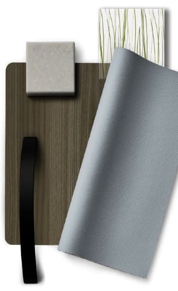
Within the context of that evidence, Midmark Dental recently introduced several new color options within their Synthesis and Artizan Expressions Cabinetry Collections. “Color, texture, and tone have the power to evoke emotion,” said Michael Couch, LEED AP BD+C, EDAC, MBA, Midmark’s Director of Marketing. “Design elements can affect how a space feels and influences the patient care experience.”


Midmark’s new color offerings lean into the calming effects of soft, cool tones; muted neutrals; and natural wood finishes—all with the aim of reducing stress for patients, enhancing feelings of calm, and increasing dental team satisfaction.

middigsept01.jpg

Inspired by Nature


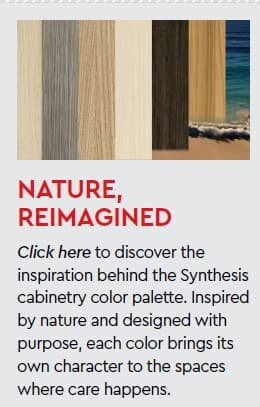
The natural environment—fields, forests, rivers, and ocean beaches—inspired Midmark’s new color palette. For example, Prairie evokes gentle movement, variation, and expansiveness, while Riverstone suggests depth, balance, and composure. Other colors within this new palette include:

Ember—subtle dimension, sophistication

Koosah Pine—rich tones, contrast

Oat—gradual tone shifts, warmth

Russet—groundedness, comfort

Sandbar—soft texture, flowing patterns


Collaborative Color Selection


Working in collaboration with practice owners, Midmark provides guidance in selecting the upholstery and cabinetry colors that reflect individual office design and function while at the same time creating an environment that leaves patients feeling good about their care experience (beyond the excellent treatment they receive). By working together, practices and Midmark can create an ideal space for care that feels supportive and reduces the anxiety many patients feel about dental care. As noted by Couch, “Esthetic design choices can help enhance patient well-being, reduce anxiety, and support healing.”

Reference

1. Tabanejad Z. The Impact of Color in Healthcare Environments: A Systematic Review and Research Agenda. Shiraz E-Med J. 2024;25(12):e146676.doi: https://doi.org/10.5812/semj-146676